|
CREATING LIFE FROM A SPONGE: THE PRE-HISTORY OF SIMMONS HALL 3. THE ARCHITECT A lot has been said about the architecture of Simmons Hall and I'd just as well not say anything more. This presentation is about the foundations of the Simmons Hall community, and if anyone learns anything from it, I hope it is the fact that there is much more to Simmons Hall than fancy architecture. But it is true that the spaces the architect provided for us would have a major impact on the achievement of our social goals. It is also true that we spent most of our time working with the architects in an attempt-- in many ways a futile one-- to see that the design appropriately addressed our goals and concerns. So I'll be talking about the architectural design process in terms of how it relates to the process of trying to create an environment that would accommodate our goals for the residential community. I'm not an architectural critic, and so if you're looking for an architectural criticism, you have come to the wrong presentation. I'll start by stating briefly that working with this particular architectural team made our job more difficult, and I think this image does a nice job of illustrating why. Steven Holl is an artist-designer. His concern was the (in this case, literally) concrete image of the building he produces. Our concern was with people and the experience they would have living in this building. Looking at this picture, what looks more important-- the image, or the people? 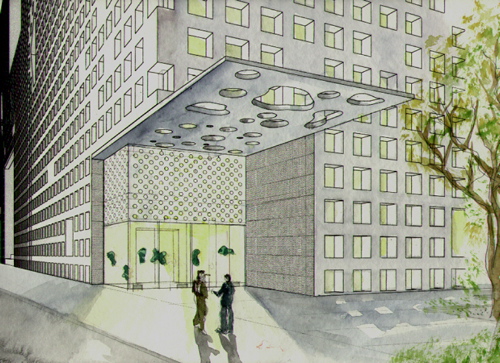 Image by Steven Holl Architects The design process started for us early in 1999. And many of you might not know this, but the sponge was not the first design concept we worked with. During the first six months of the process, we saw two completely different conceptual designs, both of which were rejected for various reasons. The first concept was the "pencil towers" scheme, which consisted of four very skinny, very tall towers, each with a different shape for its cross-section-- a circle, a square, a rhombus, and ... uh, I don't remember what the last one was. Who cares, really? The first time I saw Steven Holl, at a meeting in early 1999, he pitched this design to us. He introduced it by talking about how he hated his own college dorm experience, particularly the long, double-loaded corridor design scheme. He seemed to like the pencil tower design because it was the exact opposite. The pencil towers allowed students the opportunity to sit in their high-rise room, enjoy their view, conteplate their studies, their lives, et cetera et cetera. After seeing this, many of us in the group had to strongly but politely explain to him what we had goals for the community that involved large-scale interaction, and isolating people in high-rise towers really didn't seem to accommodate that goal. Holl responded at first simply by disagreeing with us, and did not show any interest in listening or indicating that he understands our point of view. It was not until some time later that we learned that the design team had decided to work from a different concept. I should take a moment here to mention how Holl fancied himself a master planner as well as an architect. When he began working on this project, he showed a concern that the site would be pretty isolated, and that people needed an effective and hospitable way to get there. So before actually talking to us about the conceptual design of the dorm, he proposed that we build a bridge-- a suspension bridge-- that would take pedestrians from Kresge directly to the front door of the new dorm. He also proposed another bridge to be built across Briggs Field, with houses built on top of it for faculty or others. After the meeting, these bridge ideas generated more than a few laughs-- I'm not sure if humor was his intent. But it was observant of him to note that the site was extremely difficult to get to in a pleasant way, and I think it was noble of him to try to solve this problem constructively. Unfortunately, this rather insane proposal would be the last time anyone made a serious attempt to try to bridge the new dorm site with the rest of the campus. The second design concept was one we called the "italian hillside village", and essentially it consisted of one long hallway that wound back and forth while it inclined upwards at about a one-to-twelve pitch. Rooms and lounges were all connected onto this one hallway. One of Steven Holl's proposals for the former World Trade Center site in New York bears much resemblance to this design concept-- one might even say it was the same design concept. This, I think, reflects something interesting about the way Steven Holl works. He doesn't come up with his conceptual designs so much by working with the sites and with the client's needs. He seems to have an assortment of design concepts already formed from the beginning, and he seems to use the site, and the client institution, as a showcase for these artistic ideas. Despite the peculiarity of the design, many of us on the group actually liked the italian hillside concept quite a lot because it seemed to much better support our social goals. The layout was simple, the rooms and lounges were all joined through easily walkable connecions, and the hallways and lounges worked together in a way that would make it relatively easy for people to come out of their rooms and use them. We encouraged the designers to move forward on this concept, and they worked on it for a few months. Unfortunately, it became clear after some time that the City of Cambridge would not issue a permit for such a building-- the main problem being that to hold the desired number of rooms, the building would have to be 180 feet tall, much higher than the height that was allowed. So it was on to plan C. Plan C was the sponge. The sponge was strange, and I didn't really know what to make of it. But one thing I did know was that at this point in the process, with the dorm still expected to be done by fall 2001-- and it was now nearing fall 1999-- there would not be time to develop another option. Basically, we were getting the sponge whether we liked it or not. So overall, we chose to like it. There were actually some things about the sponge idea that we liked from the beginning because we thought they would contribute to interaction and a sense of community. However, in most cases, the result turned out to be not what we expected. 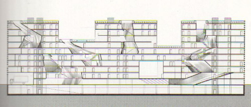 Image by Steven Holl Architects For instance, there were the atrium lounges. At first, we reacted very positively to the idea of these amorphous "holes" that ran vertically up through the building. I liked them, not because I liked the idea of curvy, slanty walls, but because these "atria" were originally envisioned as large spaces that opened up into the hallways and connected floors of the building in clever ways. They would serve as focal points not just for floors, but for whole vertical sections of the building, and the whole system of lounges would promote flow throughout the entire building. But the idea ran into a problem along the way. Basically, these lounges were viewed by engineers, contractors, and fire safety specialists as big chimneys that would spread smoke throughout the building in the event of fire. The designers' solution to this problem was to make the spaces smaller and close them off from the hallways.  As the design progressed over the span of several months, the atria became smaller and smaller and more enclosed. Instead of serving as the main nodal points of the building, they became small, cavernous offshoots that we knew would not attract or encourage social interaction. In the end, even the atrium lounges on the tower parts of the building, which were supposed to bind each of the tower sections together via stairwells, would have to have those stairwells removed because there wasn't enough space for them. This effectively isolated the floors in the towers from one another, along with the rest of the dorm.  The sponge design also offered the opportunity for some truly fantastic roof deck areas. In the early building designs, all of the roof terraces were all connected directly to hallways, allowing access by all residents. This would have provided great spaces for informal interaction among students as well as parties. Unfortunately, this did not sit well with the MIT safety office-- especially since less than a year before, a student had committed suicide by jumping from the top of MacGregor. MIT's safety officers sent a rigid directive to the designers-- copied to the Founders Group-- telling them to either restrict students' access to the roof decks, or enclose all of them with some kind of fence. The architects thought that a fence would look terrible, and decided to alter the layout so that all of the terraces were accessible only through housemaster, visiting scholar or GRT apartments. People on the Founders Group didn't altogether agree on how we felt about this-- but the students on the group certainly didn't like it. I personally pleaded with the people in the safety office to come and discuss the matter with us to find a solution that would allow students access but still address safety concerns. They declined the offer. So now, all the roof terraces are essentially part of housemaster and GRT apartments, which offers nice opportunities for GRT or Housemaster-sponsored study breaks, but does not allow for the informal interaction we were hoping to encourage. From these types of experiences-- and there were many others like it-- I learned some important things. First, it was clear that the designers would never compromise an aesthetic feature of the design in favor of supporting our goals for interaction and community. That was not the style of Holl's design firm. Given a choice between simplifying the design of lounges to accentuate their function and compromising their function in order to preserve their aesthetic style, this design team would always choose the latter. They might make some changes here and there so that it seemed like they were responding to our comments, but if their artistic vision did not coincide with our goals, then too bad for us. We also learned that within the larger structure of MIT, we had no real power to make demands on this project. We were dealing with too many contraints-- time, cost, and the already established goal of creating an architecturally distinguished building. If we wanted to make a difference, we needed to really convince the designers, not to mention MIT administrators up and down the ladder, that we were right. In most cases, we were destined to fail. It was with that determined yet cynical mindset that I continued in my role as an advisor to the design team. I recall that at one point, among those of us in the Founders Group, we had different people assigned to harass the architects about different aspects of the design. For quite a while, my job was to argue about the hallway vestibules, to get the architects to open them up more, or to somehow make them useful, and not just an empty buffer zone between students' private rooms and the public forum of the hallways. Some others in the group were assigned to argue about the colors on the window insets, which at first were somewhat garish and arranged in an ugly, boxy pattern, and after some prodding from members of the group, were changed to reflect the structural support grid of the building. On each subject, the designers would come back having made some minor changes so that we would feel like we were heard. But they knew that we had no real power to make demands, and so most often we didn't get much more than a simple acknowledgement. The last thing I recall talking to the designers about was furniture. While Steven Holl's firm didn't originally have a contract to design the building's furniture, he desperately wanted to make sure that the furniture design matched the unique aesthetic quality of the building. So the last presentation I got to see Holl make was a furniture presentation, showing us his custom-designed room furniture along with other furniture and accessories selected from other designers-- right down to the perforated waste baskets. 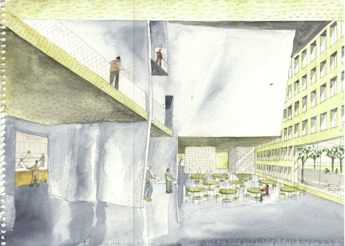 Something that some of you might have already heard me talking about to great end is the dining hall furniture, which was chosen by Holl as well. I talk about this a lot because it's something I was, and still am, passionate about. Dinner time was probably the most important and dependable element of my life at MIT. It was over the large, round tables of the Baker House dining hall, which forced people to sit in large groups and face one another, that I was able to make friends, exchange jokes and ideas, and generally unwind from a difficult day of work, class and study. When Steven Holl was designing the dining hall for Simmons, he was modeling it on another design of his-- the cafe in his Helsinki museum. He mentioned that cafe about every time I saw him, which he thought was the greatest thing ever because it was so popular that it stayed open even after the museum closed. I thought this was all well and good, but I also tried to explain to Holl that the dining hall experience is different from that of a cafe. Specifically, I pressed on him the idea that a dining hall needed large tables, ideally round tables, because they allowed large groups of people to sit together and encouraged encounters among diverse groups of people. This became somewhat of an irrational obsession of mine, and I remember arguing with Holl about it over and over again, one-on-one on many occasions, even showing the Baker dining hall to him in person once. About all I ever got in return were blank stares. In the end, Holl's original idea stood, and we got the furniture you have, tiny tables that mostly seat four, and no more than six. I'll tell a story here that most people get a kick out of, and it's not a very important story but I think it marks the point at which I completely gave up on trying to influence the design process. It was when Steven Holl was presenting his furniture designs for the rooms, and we were all standing in the room "mock-up", which was a to-scale Simmons Hall dorm room that was built on the Westgate parking lot while the actual building was under construction. In the mock-up, I noticed that the small strip of wall behind the recessed lighting at the top of the room was painted a flourescent green. I asked if that was really intended to be painted that color and the answer was yes. So I asked Holl, trying to adopt a straightforward tone, if that was going to make the whole room glow an eerie green when it was dark out and the lights were on. I didn't get a straight answer, but Holl did defend his choice of color. Later on, I learned that people living at Next House had started calling that the "kryptonite room", for obvious reasons. Later on, the development project manager assured us that there was no way he would allow that color to be painted in the actual rooms. The long, complex experience of working in a client role with Steven Holl's firm can be summed up very simply. It's been widely reported that Holl's inspiration for Simmons Hall came to him while he was in the bathtub washing himself with a sponge. This, I feel, is an apt metaphor for the entire design process. Steven Holl, in his bathtub, indulging his own desires, and seemingly oblivious to the issues that were of concern to others. This isn't to say that I would call Steven Holl a bad architect. I'm not an architectural critic, and I don't pretend to be one. But I do know a lot about project development processes, and working with a client to achieve its program goals does not seem to be Holl's strong suit-- except when the client's only goal is only to have a building that is unique and innovative in an artistic sense. It seems as if that's to be expected with Holl, and so if the results do not match the client's goals, perhaps it's not so much the architect's fault, but the client's fault for hiring him. We saw Holl himself pretty rarely, and on that subject I should recognize Tim Bade, the project manager on Steven Holl's staff for this project. Tim was the one who met with us and did all the things Holl seemed not to be interested in doing-- listen to us, try to understand our concerns, and respond to them. I liked working with Tim. He's sure to be a great architect himself, and perhaps at some point in the future when he has his own firm, MIT will work with him again. Finally, I should mention one of the most subtle and difficult challenges that the architecture presented to us as a Founders Group, one that residents of Simmons Hall still have to struggle with today, and it's one where the architects definitely aren't to blame. That is the challenge of ownership. As I stated earlier, we wanted to ensure that the residents of the building truly owned it. But throughout the process, and even today, the people who are talk about Simmons Hall, along with the hundreds who wander in to gawk at it, know it only as "Steven Holl's new piece at MIT". Simmons Hall is not Steven Holl's "piece." It is your home. And don't let anyone tell you otherwise. copyright Jeffrey C. Roberts, 2004 |